Renaissance Festival Design
The objective of this project was to create engaging promotional designs for the Minnesota Renaissance Festival that captured the fair’s whimsical atmosphere while remaining visually cohesive with its established brand identity. Drawing from years of personal experience attending the festival, I approached the project with a strong understanding of its culture, audience, and immersive storytelling—using that insight to develop social media graphics and promotional concepts designed to feel energetic, theatrical, and authentic to the festival experience.
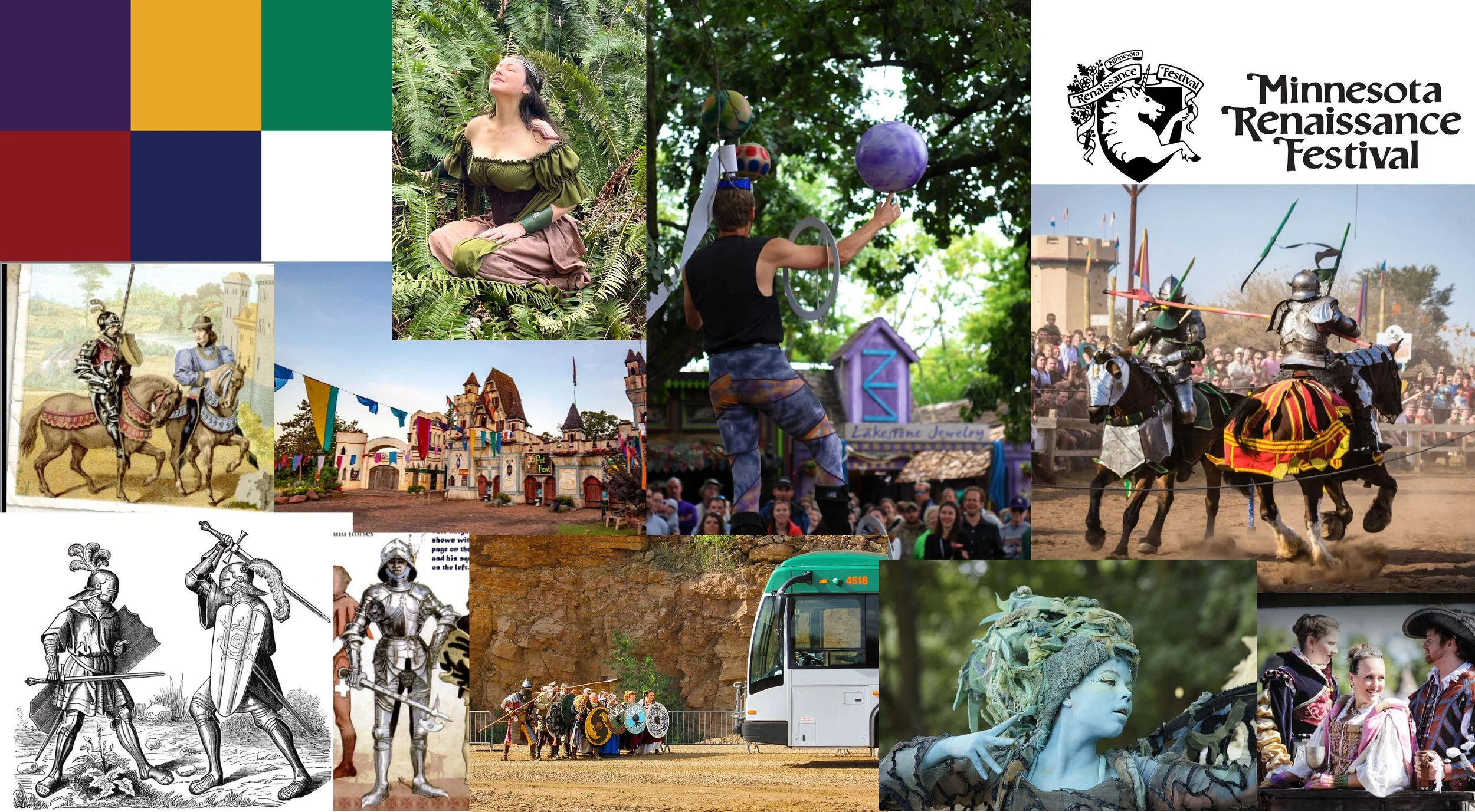
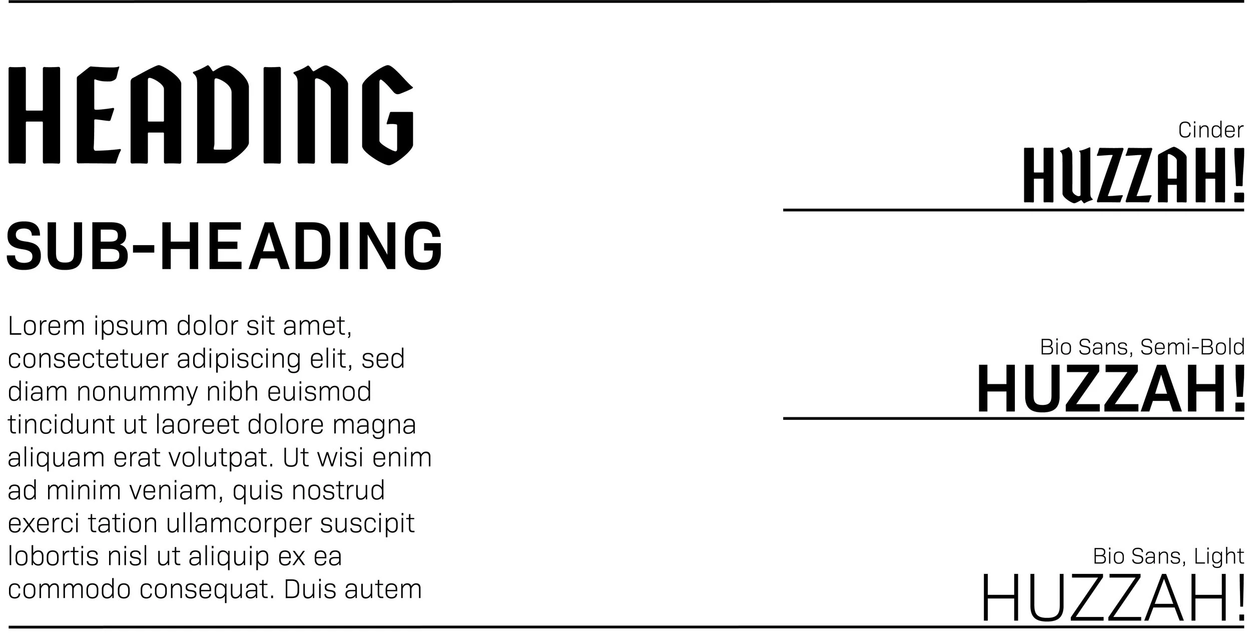
To establish a clear visual direction, I began by collecting existing brand elements from the Minnesota Renaissance Festival, including typography, promotional photography, color palettes, and past social media materials. I organized these references into a mood board to better understand the festival’s visual language and overall tone.
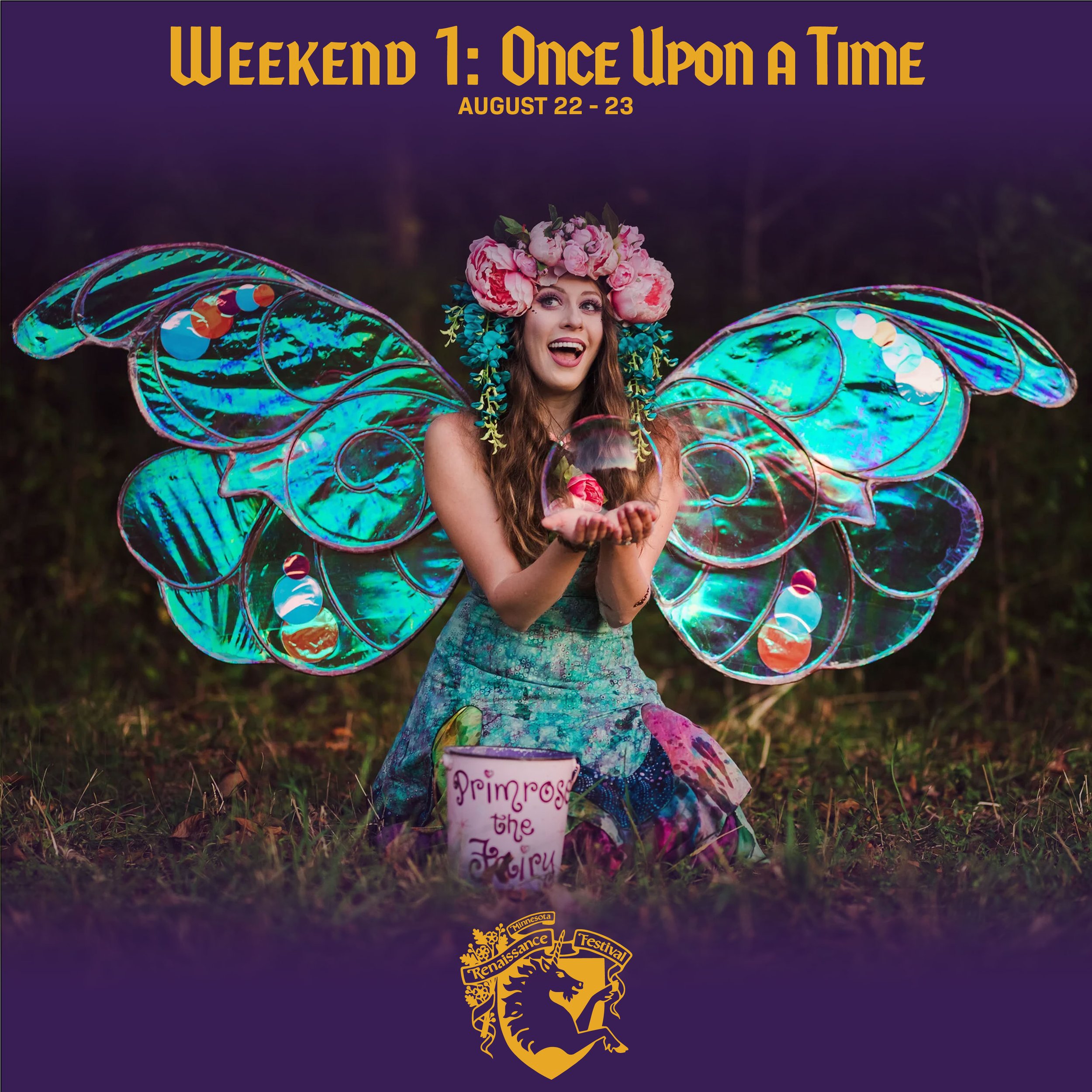
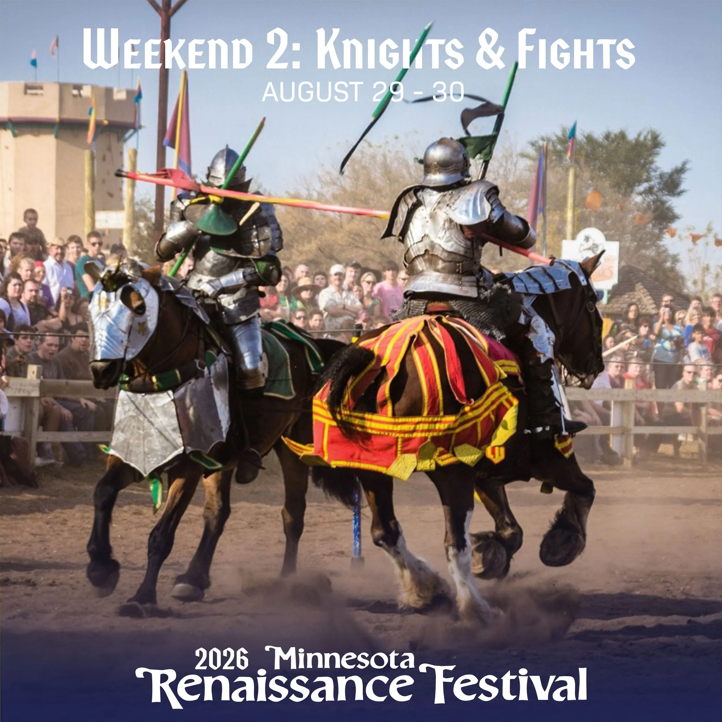
Using this research as a foundation, I developed a series of social media concepts that combined branded design elements with immersive festival photography. My goal was to create graphics that felt cohesive with the festival’s existing marketing while introducing a more polished visual hierarchy, stronger composition, and improved consistency across the designs.

This project strengthened my ability to translate brand identity into a structured digital system. The focus on developing a visual direction that balances theatrical medieval aesthetics with modern social media clarity. Emphasis was placed on hierarchy, readability, and adaptability across promotional formats.
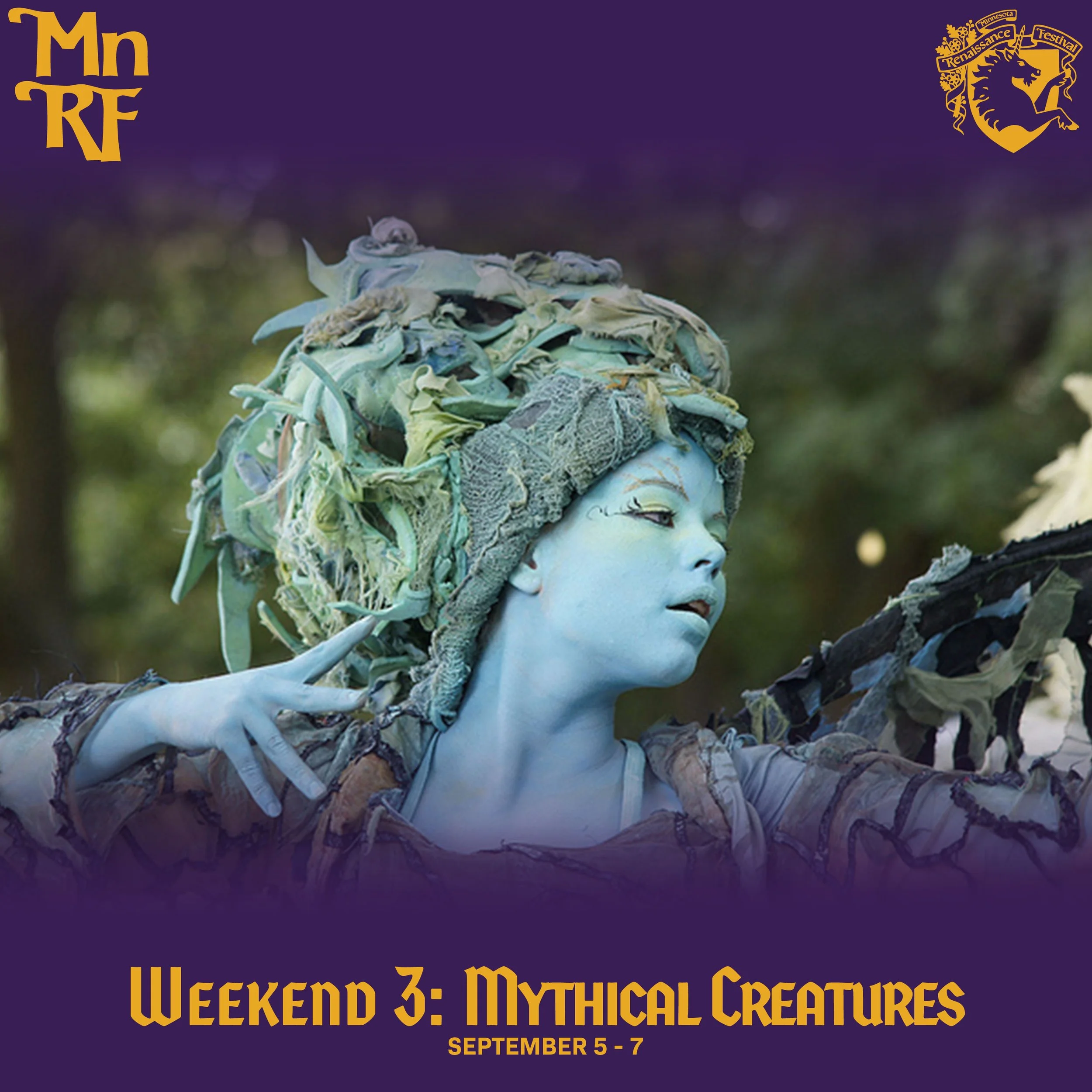
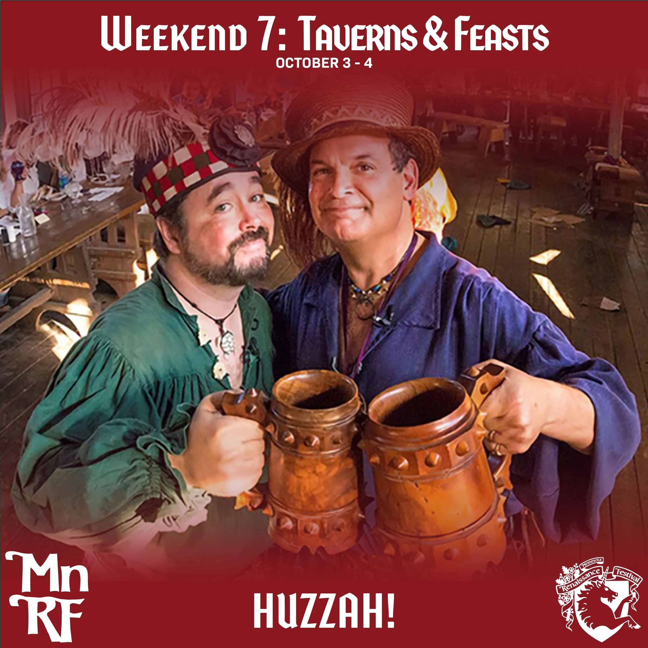
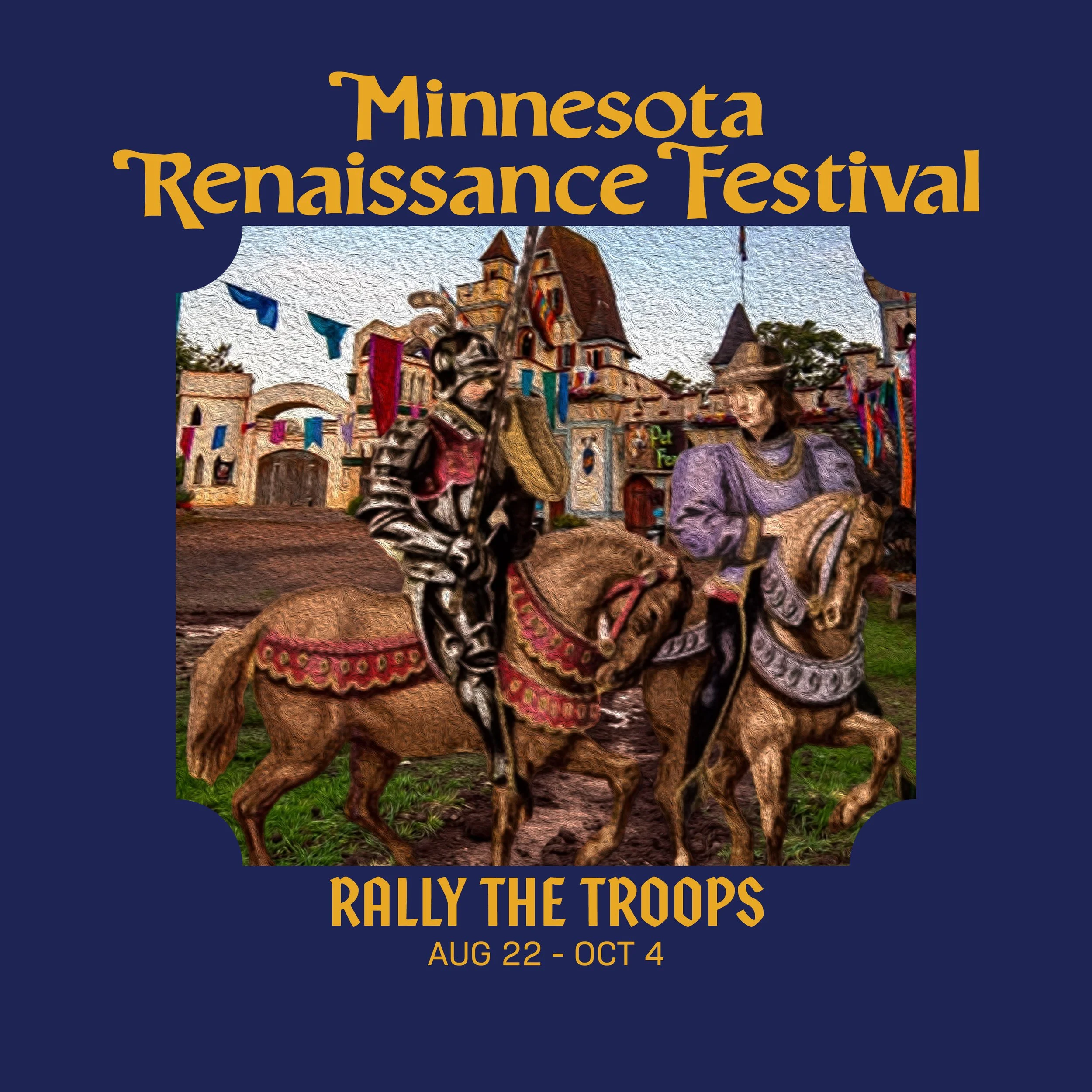
Final Designs for Social Media Posts


Movie Poster Redesign
Project Overview
This project explores how movie posters can more effectively reflect narrative identity, thematic tone, and key story elements by prioritizing scene-based visual storytelling over generic promotional imagery. The goal was to redesign posters for Inception, The Dirt, and Inglorious Basterds to improve genre clarity, visual hierarchy, and narrative accuracy for audiences already familiar with the films.
Design Challenge
Contemporary movie posters often prioritize marketing aesthetics over narrative accuracy, resulting in visuals that fail to reflect key moments, props, or emotional tone from the film itself. This project challenges that approach by reinterpreting posters through a story-first design lens, focusing on recognizable in-film elements and stronger genre communication.
Concept Development
For each film, I developed five initial conceptual directions exploring different interpretations of tone, symbolism, and narrative emphasis. These variations tested how composition, typography, and imagery could communicate core themes such as psychological tension, aggression, and authority.
Mentor feedback guided refinement of composition clarity, typographic hierarchy, and thematic consistency across all three posters. Iterations focused on reducing visual noise, strengthening focal points, and improving readability at thumbnail scale.
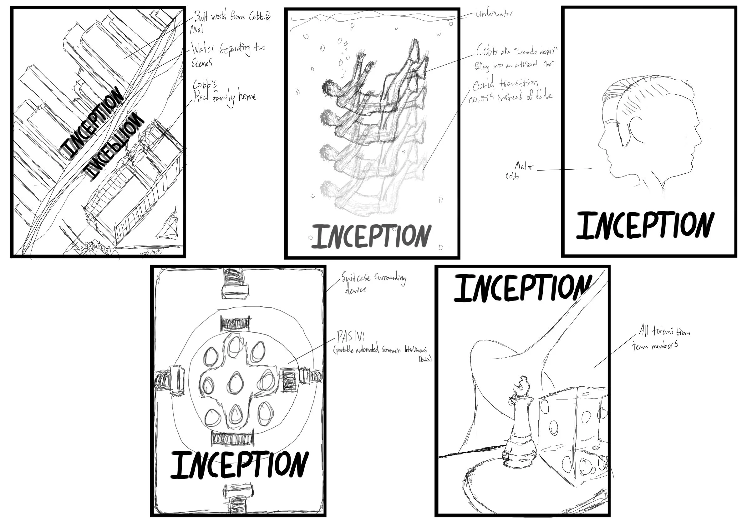
Inception Movie Poster Concepts (1)
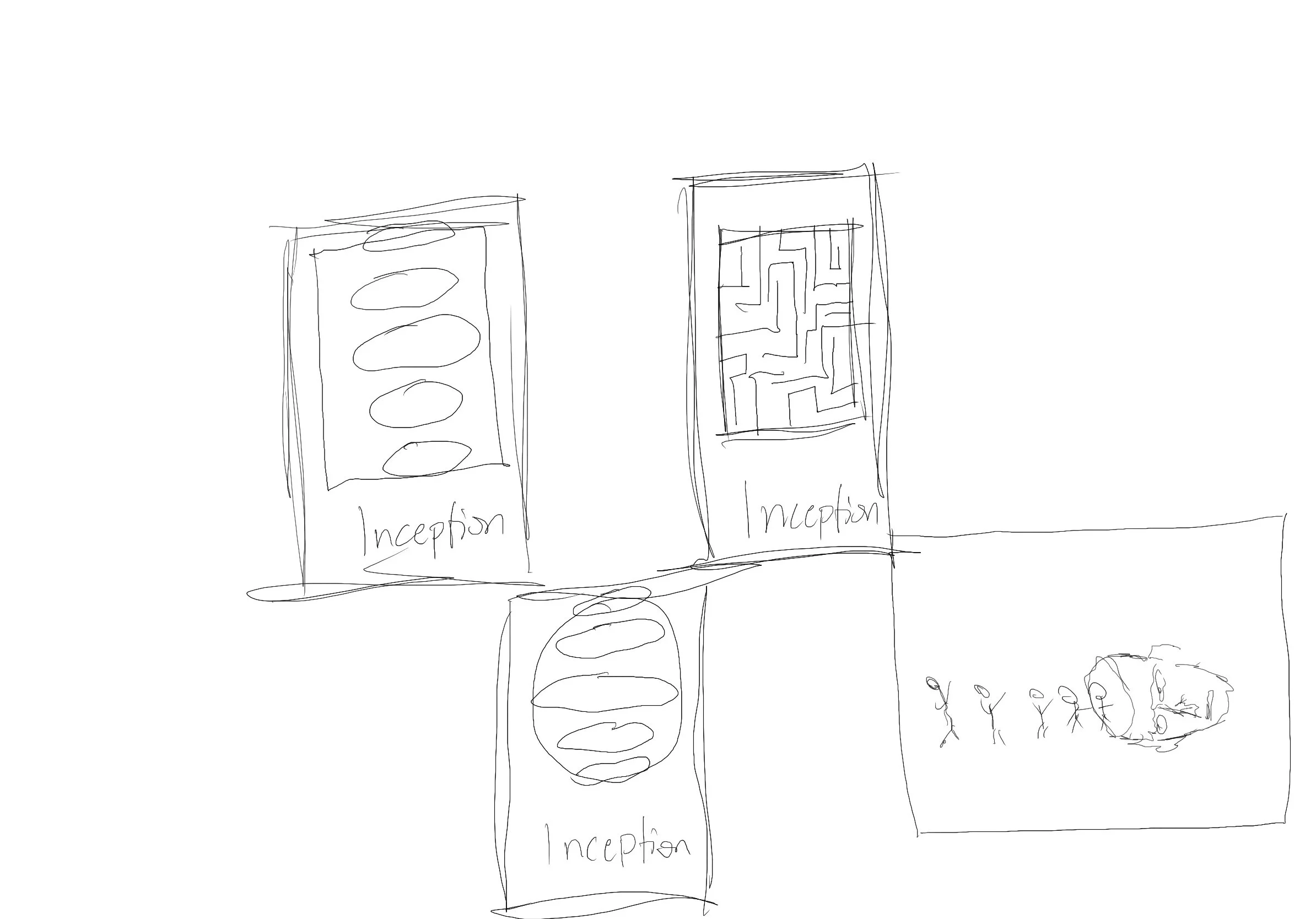
Inception Movie Poster Concepts (2)
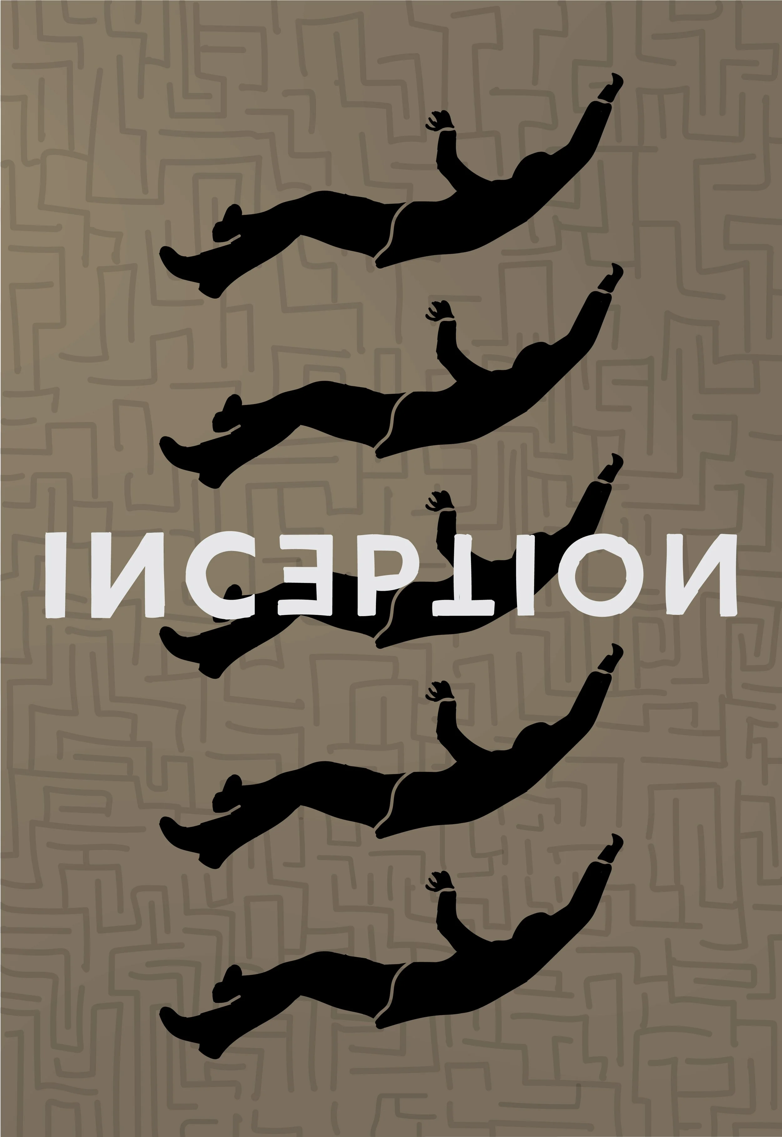
Inception Movie Poster Redesign Final
The Inception poster explores psychological fragmentation and layered reality through a structured visual hierarchy and repetition. The composition centers on a focal point, supported by layered background imagery that suggests depth and a recursive structure.
A muted beige base palette was chosen to create visual ambiguity and subtle contrast, allowing darker tonal elements to emerge gradually rather than dominate immediately.
Large-scale typography is centered to establish an immediate hierarchy, anchoring the viewer before secondary visual elements, such as maze-like background structures, are noticed.
The repeated character motif reinforces the concept of layered dreaming states, creating visual rhythm and fragmentation throughout the composition
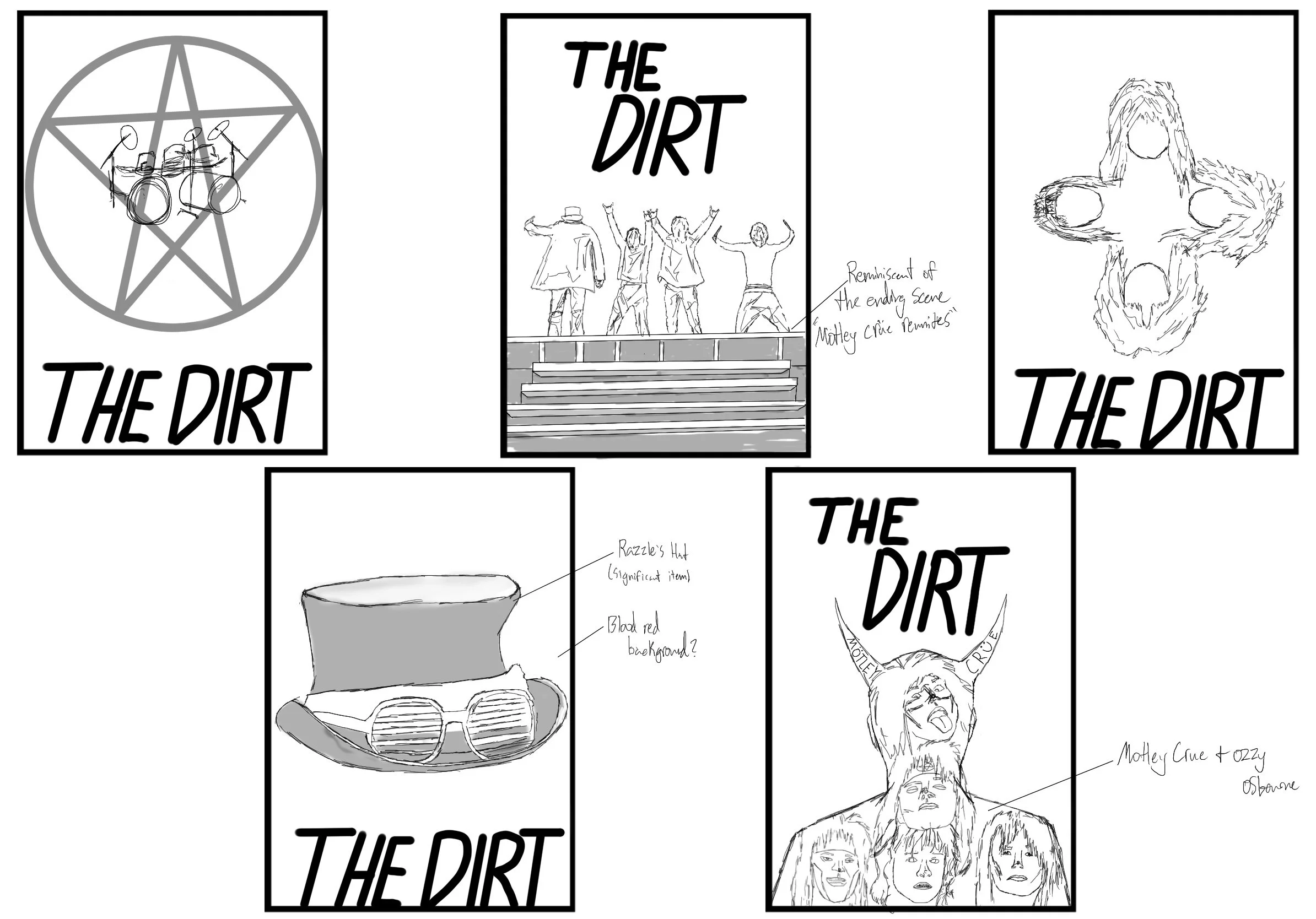
The Dirt Movie Poster Concepts (1)
The Dirt Movie Poster Concepts (2)
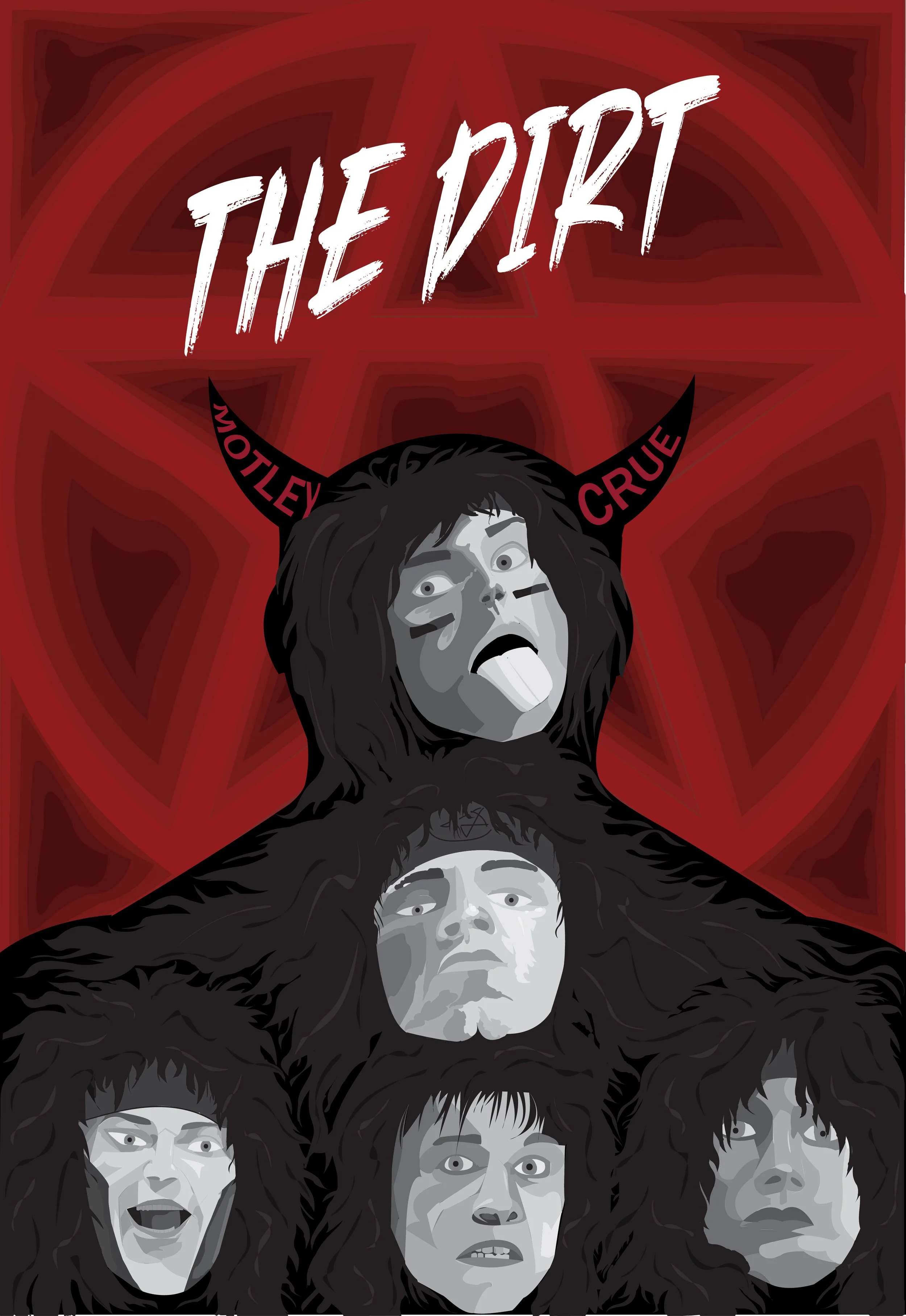
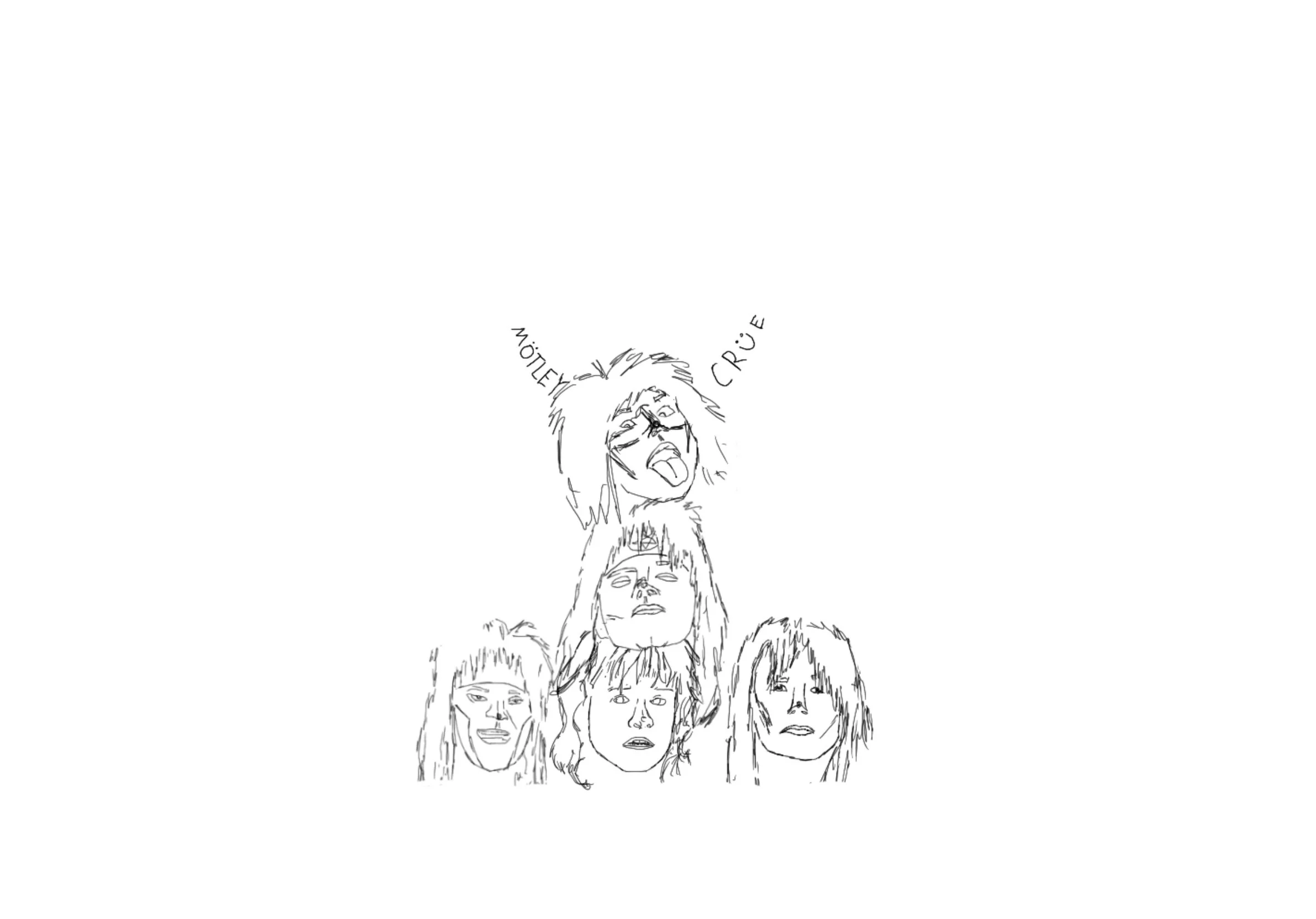
The Dirt Movie Poster Redesign Final
The Dirt poster conveys aggression, chaos, and volatility through a high-contrast composition and a limited color palette. A red-and-black palette establishes immediate genre recognition and emotional intensity.
The central composition unifies the band into a cohesive visual form, reinforcing themes of collective identity and destructive momentum. Typographic placement is deliberately dense, mirroring the subject matter's chaotic energy.
Decorative elements, such as horn motifs, serve as symbolic reinforcement of excess, rebellion, and distorted identity.
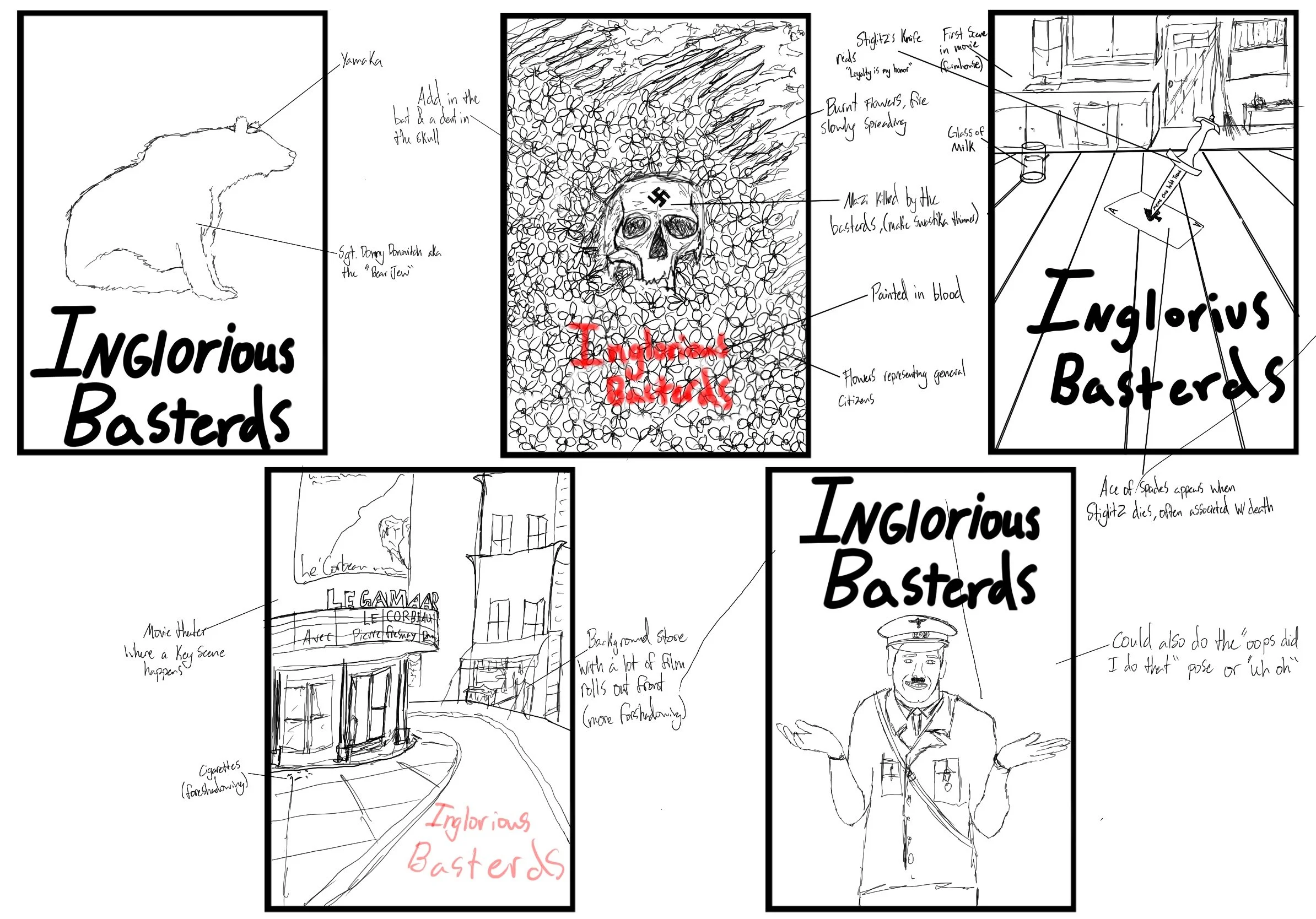
Inglorious Basterds Movie Poster Concepts (1)
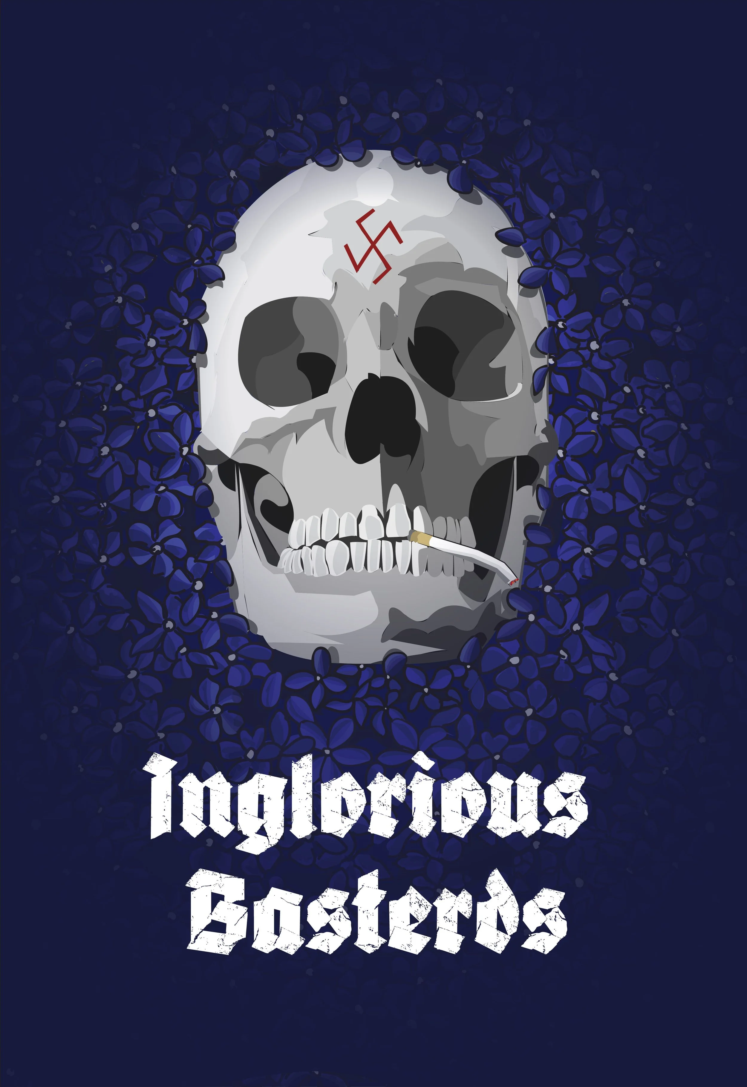
Inglorious Basterds Movie Poster Redesign Final
The Inglorious Basterds poster balances tension between authority, violence, and control through restrained color hierarchy and structured composition.
A controlled blue-dominant palette was used to contrast the intensity of underlying themes, creating visual tension between emotional content and compositional restraint.
Typography is positioned with deliberate spacing to emphasize authority and order, contrasting with narrative themes of disruption and rebellion.
Key visual elements are arranged to suggest conflict between structure and chaos rather than a literal depiction.
Final System Overview
The final series establishes a consistent approach to narrative-driven poster design, prioritizing story accuracy, genre clarity, and structured visual hierarchy over traditional promotional aesthetics. Each poster functions as both a marketing piece and a narrative artifact, designed to resonate with audiences familiar with the films.